Για αυτό το 15ο Prompt της Τρίτης, η ιδέα ήταν να δοκιμαστεί ένα νέο είδος χρήσιμου και οπτικά ισχυρού περιβάλλοντος: ένα dashboard προσωπικής προόδου για την παρακολούθηση στόχων στους βασικούς τομείς της ζωής.
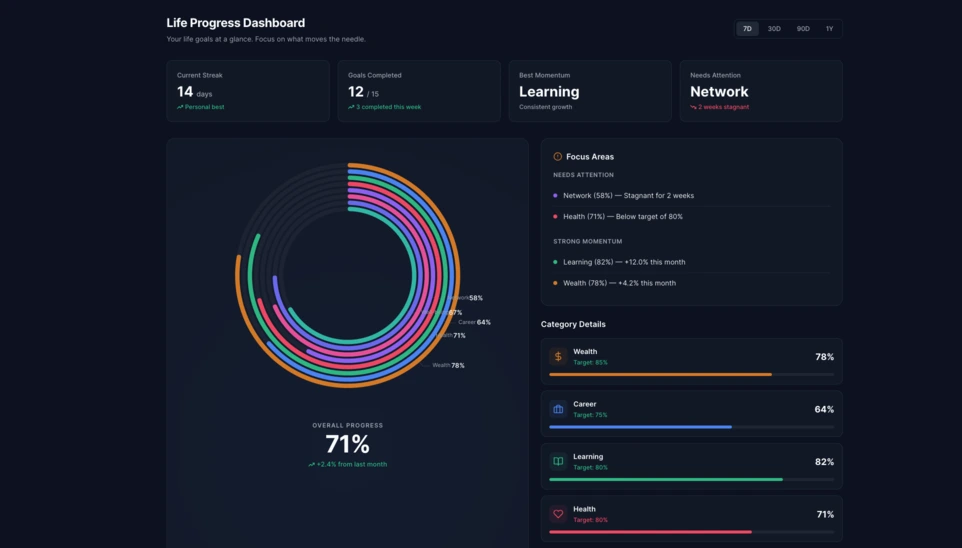
Στο Linkeum, τα Prompt της Τρίτης δεν χρησιμοποιούνται μόνο για τη δημιουργία εντυπωσιακών οπτικά demo, αλλά και για τη δοκιμή διεπαφών που ίσως μια μέρα γίνουν πραγματικά κομμάτια του προϊόντος. Σε αυτή τη 15η έκδοση, η ιδέα ήταν να δημιουργηθεί ένα dashboard προσωπικής προόδου ικανό να δείχνει καθαρά την πρόοδο ενός χρήστη σε πολλαπλές διαστάσεις της ζωής του.
Ο στόχος ήταν να ξεπεραστεί μια απλή λίστα στόχων και να φανταστούμε ένα πραγματικό component dashboard που να είναι ευανάγνωστο, σύγχρονο και αρκετά ισχυρό οπτικά ώστε να αξίζει περαιτέρω διερεύνηση.
Το prompt που χρησιμοποιήθηκε
Αυτή τη φορά, το prompt γράφτηκε σε λειτουργία code only, ώστε να προκύψει απευθείας ένα αυτόνομο αρχείο HTML, εύκολο στη δοκιμή, εύκολο στη λήψη screenshot και δυνητικά επαναχρησιμοποιήσιμο αργότερα μέσα στο Linkeum.
Το prompt που στάλθηκε στο Qwen ήταν το εξής:
Generate code only.
Create a single self-contained HTML file with embedded CSS and JavaScript that builds a premium “Life Progress Dashboard” for Linkeum.
GOAL
The dashboard must help a user track progress across the major areas of life based on personal goals.
This is not a landing page.
This is not a marketing page.
This is a real product dashboard section designed for daily use.MAIN VISUAL
Build a large multi-ring radial progress chart as the main hero visualization.
Use a free JavaScript charting library suitable for radial / circular progress visualization.
Prefer Apache ECharts.The chart must represent 8 life categories:
- Wealth
- Career
- Learning
- Health
- Network
- Personal Projects
- Discipline
- Well-being
Each category must have:
- a progress percentage,
- a target marker or target logic,
- a label,
- a distinct but refined visual treatment.
Use realistic sample values such as:
- Wealth: 78
- Career: 64
- Learning: 82
- Health: 71
- Network: 58
- Personal Projects: 69
- Discipline: 75
- Well-being: 67
At the center of the radial visualization, display:
- “Overall Progress”
- and a combined percentage, for example 71%
The radial chart should look elegant, structured, readable, and premium.
Do not make it look playful or gimmicky.
Do not create a chaotic radar chart.
Do not use a generic fitness-app aesthetic.LAYOUT
Create a full dashboard section around the chart with:
- A left or center main chart area.
- A right-side details panel with category cards.
- Small KPI cards above or below for:
- Current streak
- Goals completed this week
- Best momentum
- Needs attention
- A “Focus Areas” card listing:
- Top 2 categories falling behind
- Top 2 categories improving fastest
- Small trend indicators or mini progress bars in the detail cards.
DESIGN STYLE
The design must match a premium Linkeum-like style:
- deep navy background or navy-tinted surfaces
- lighter blue highlights
- subtle amber/gold accents
- clean white or off-white text
- modern, professional, executive-grade UI
- modern fintech + personal intelligence dashboard
Avoid:
- neon colors
- rainbow palettes
- glassmorphism overload
- generic startup hero sections
- excessive gradients
- cartoonish visuals
Use a refined design system with:
- modern spacing
- subtle borders
- soft shadows
- polished cards
- clean typography
- a strong visual hierarchy
TECHNICAL REQUIREMENTS
- Output only one HTML file
- Include all CSS and JavaScript inside the HTML
- Use CDN imports only if needed
- Prefer Apache ECharts via CDN
- The result must run immediately when saved as an .html file and opened in a browser
- No external assets except the chart library CDN and web fonts if needed
- No frameworks like React, Vue, or Tailwind
- Pure HTML, CSS, and JavaScript only
- Code must be clean, readable, and well-structured
RESPONSIVENESS
The dashboard must be responsive.
- On desktop: chart + side panel layout
- On mobile: stacked layout with excellent readability
- Maintain strong visual hierarchy on smaller screens
INTERACTION
Even if this is a static HTML demo, make the UI feel interactive:
- hover states on cards
- hover emphasis on chart areas if possible
- subtle animated loading for the chart
- filter tabs such as 7D / 30D / 90D / 1Y
- active state styling
CONTENT
Use realistic product-like copy, for example:
- “Your life goals at a glance”
- “Focus on what moves the needle”
- “2 categories need attention this week”
- “Momentum is strongest in Learning and Wealth”
QUALITY BAR
The result should look like a real product dashboard mockup that could be screenshotted for an article and potentially reused later in a real product.Do not explain anything.
Do not output markdown.
Do not wrap the code in triple backticks.
Output raw HTML only.
Το αποτέλεσμα
Το αποτέλεσμα που δημιούργησε το Qwen αποτελεί μια πολύ πειστική βάση. Η διεπαφή οργανώνεται γύρω από ένα μεγάλο πολυδακτυλικό ακτινικό γράφημα στο κέντρο, συνοδευόμενο από κάρτες KPI, ένα πάνελ εστίασης και μπλοκ λεπτομερειών ανά κατηγορία.
Αυτό που κάνει τη δοκιμή ενδιαφέρουσα δεν είναι μόνο το οπτικό αποτέλεσμα. Ακόμη πιο σημαντικό είναι ότι η AI δημιούργησε μια αξιόπιστη και επαναχρησιμοποιήσιμη δομή dashboard, ήδη αρκετά καθαρή ώστε να αποτελέσει βάση για ένα μελλοντικό module του Linkeum.
Γιατί αυτή η δοκιμή έχει σημασία
Αυτό το Prompt της Τρίτης δείχνει ότι ένα καλό prompt μπορεί να παράγει κάτι περισσότερο από ένα εντυπωσιακό demo. Μπορεί επίσης να βοηθήσει στη γρήγορη πρωτοτυποποίηση μιας πραγματικής διεπαφής προϊόντος, με σαφή λογική, συνεκτική ιεραρχία και πιθανή αξία σε μεσοπρόθεσμο ορίζοντα.
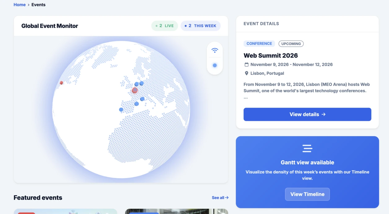
Μετά την διαδραστική υδρόγειο που ενσωματώθηκε στην ενότητα Events, αυτό το ακτινικό dashboard συνεχίζει πολύ καλά την ίδια λογική: γρήγορη δοκιμή, συγκεκριμένη οπτικοποίηση και στη συνέχεια απόφαση για το αν η ιδέα αξίζει να προχωρήσει περισσότερο μέσα στο Linkeum.