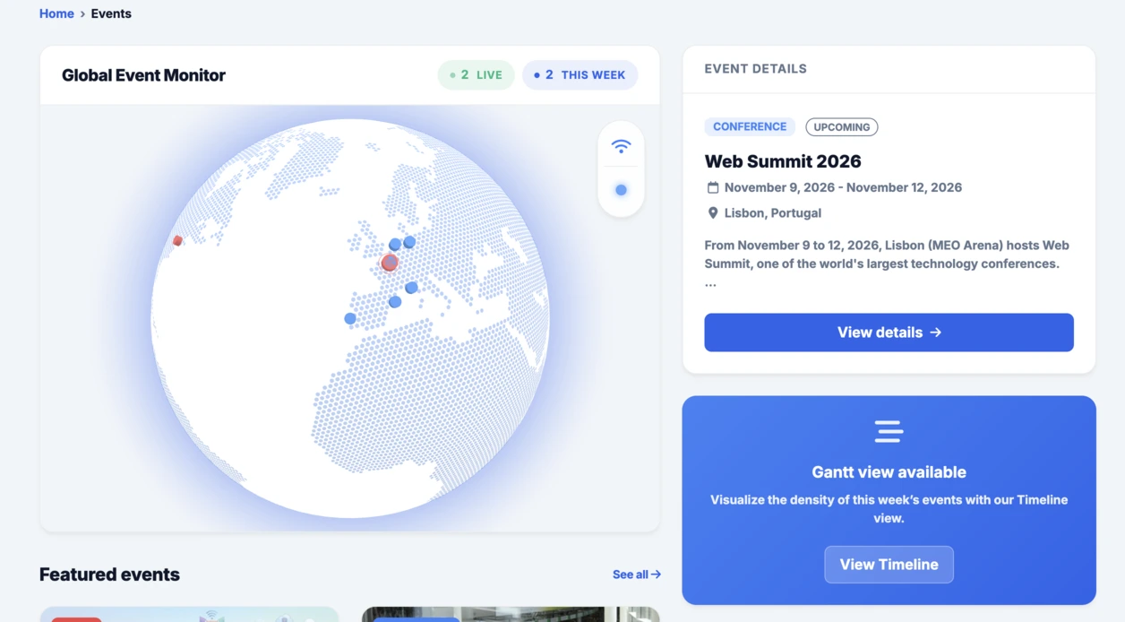
Für diesen 15. Dienstagsprompt bestand die Idee darin, eine neue Art von nützlicher und visuell starker Oberfläche zu testen: ein persönliches Fortschritts-Dashboard zur Verfolgung von Zielen in den wichtigsten Lebensbereichen.
Bei Linkeum dienen die Dienstagsprompts nicht nur dazu, visuell ansprechende Demos zu erzeugen, sondern auch dazu, Interfaces zu testen, die eines Tages zu echten Bausteinen des Produkts werden könnten. In dieser 15. Ausgabe bestand die Idee darin, ein persönliches Fortschritts-Dashboard zu generieren, das den Fortschritt eines Nutzers über mehrere Lebensdimensionen hinweg klar darstellt.
Das Ziel war es, über eine einfache Zielliste hinauszugehen und ein echtes Dashboard-Modul zu entwerfen, das gut lesbar, modern und visuell stark genug ist, um eine weitergehende Erforschung zu rechtfertigen.
Der verwendete Prompt
Dieses Mal wurde der Prompt im Modus code only formuliert, um direkt eine autonome HTML-Datei zu erhalten, die leicht zu testen, leicht als Screenshot festzuhalten und potenziell später innerhalb von Linkeum wiederverwendbar ist.
Der an Qwen gesendete Prompt lautete wie folgt:
Generate code only.
Create a single self-contained HTML file with embedded CSS and JavaScript that builds a premium “Life Progress Dashboard” for Linkeum.
GOAL
The dashboard must help a user track progress across the major areas of life based on personal goals.
This is not a landing page.
This is not a marketing page.
This is a real product dashboard section designed for daily use.MAIN VISUAL
Build a large multi-ring radial progress chart as the main hero visualization.
Use a free JavaScript charting library suitable for radial / circular progress visualization.
Prefer Apache ECharts.The chart must represent 8 life categories:
- Wealth
- Career
- Learning
- Health
- Network
- Personal Projects
- Discipline
- Well-being
Each category must have:
- a progress percentage,
- a target marker or target logic,
- a label,
- a distinct but refined visual treatment.
Use realistic sample values such as:
- Wealth: 78
- Career: 64
- Learning: 82
- Health: 71
- Network: 58
- Personal Projects: 69
- Discipline: 75
- Well-being: 67
At the center of the radial visualization, display:
- “Overall Progress”
- and a combined percentage, for example 71%
The radial chart should look elegant, structured, readable, and premium.
Do not make it look playful or gimmicky.
Do not create a chaotic radar chart.
Do not use a generic fitness-app aesthetic.LAYOUT
Create a full dashboard section around the chart with:
- A left or center main chart area.
- A right-side details panel with category cards.
- Small KPI cards above or below for:
- Current streak
- Goals completed this week
- Best momentum
- Needs attention
- A “Focus Areas” card listing:
- Top 2 categories falling behind
- Top 2 categories improving fastest
- Small trend indicators or mini progress bars in the detail cards.
DESIGN STYLE
The design must match a premium Linkeum-like style:
- deep navy background or navy-tinted surfaces
- lighter blue highlights
- subtle amber/gold accents
- clean white or off-white text
- modern, professional, executive-grade UI
- modern fintech + personal intelligence dashboard
Avoid:
- neon colors
- rainbow palettes
- glassmorphism overload
- generic startup hero sections
- excessive gradients
- cartoonish visuals
Use a refined design system with:
- modern spacing
- subtle borders
- soft shadows
- polished cards
- clean typography
- a strong visual hierarchy
TECHNICAL REQUIREMENTS
- Output only one HTML file
- Include all CSS and JavaScript inside the HTML
- Use CDN imports only if needed
- Prefer Apache ECharts via CDN
- The result must run immediately when saved as an .html file and opened in a browser
- No external assets except the chart library CDN and web fonts if needed
- No frameworks like React, Vue, or Tailwind
- Pure HTML, CSS, and JavaScript only
- Code must be clean, readable, and well-structured
RESPONSIVENESS
The dashboard must be responsive.
- On desktop: chart + side panel layout
- On mobile: stacked layout with excellent readability
- Maintain strong visual hierarchy on smaller screens
INTERACTION
Even if this is a static HTML demo, make the UI feel interactive:
- hover states on cards
- hover emphasis on chart areas if possible
- subtle animated loading for the chart
- filter tabs such as 7D / 30D / 90D / 1Y
- active state styling
CONTENT
Use realistic product-like copy, for example:
- “Your life goals at a glance”
- “Focus on what moves the needle”
- “2 categories need attention this week”
- “Momentum is strongest in Learning and Wealth”
QUALITY BAR
The result should look like a real product dashboard mockup that could be screenshotted for an article and potentially reused later in a real product.Do not explain anything.
Do not output markdown.
Do not wrap the code in triple backticks.
Output raw HTML only.
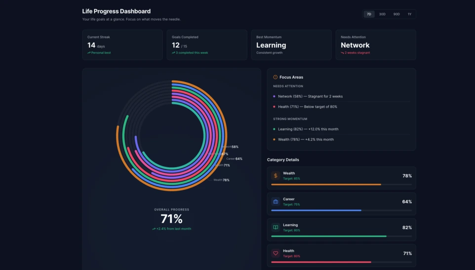
Das Ergebnis
Das von Qwen erzeugte Ergebnis ist eine sehr überzeugende Grundlage. Die Oberfläche stützt sich auf ein großes mehrschichtiges Radialdiagramm im Zentrum, ergänzt durch KPI-Karten, ein Fokuspanel und Detailblöcke pro Kategorie.
Interessant ist hier nicht nur der visuelle Effekt. Noch wichtiger ist, dass die KI eine glaubwürdige, wiederverwendbare Dashboard-Struktur erzeugt hat, die bereits sauber genug ist, um als Grundlage für ein zukünftiges Linkeum-Modul zu dienen.
Warum dieser Test wichtig ist
Dieser Dienstagsprompt zeigt, dass ein guter Prompt mehr hervorbringen kann als nur eine beeindruckende Demo. Er kann auch dabei helfen, schnell einen Prototyp für ein echtes Produkt-Interface zu erstellen – mit klarer Logik, kohärenter Hierarchie und potenziellem mittelfristigem Nutzen.
Nach dem interaktiven Globus, der in den Events-Bereich integriert wurde, setzt dieses radiale Dashboard dieselbe Logik gut fort: schnell testen, konkret visualisieren und dann entscheiden, ob die Idee innerhalb von Linkeum weiterentwickelt werden sollte.