W tym 15. Wtorkowym Prompcie pomysł polegał na przetestowaniu nowego typu użytecznego i mocnego wizualnie interfejsu: dashboardu postępu osobistego do śledzenia celów w najważniejszych obszarach życia.
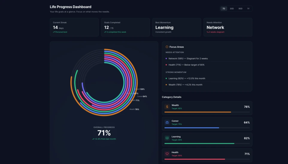
W Linkeum Wtorkowe Prompty nie służą wyłącznie do tworzenia atrakcyjnych wizualnie dem, ale także do testowania interfejsów, które pewnego dnia mogą stać się realnymi częściami produktu. W tej 15. edycji pomysł polegał na wygenerowaniu dashboardu postępu osobistego, który potrafi jasno pokazać postępy użytkownika w wielu wymiarach życia.
Celem było wyjście poza prostą listę celów i wyobrażenie sobie prawdziwego komponentu dashboardu, który byłby czytelny, nowoczesny i na tyle mocny wizualnie, by uzasadniać dalsze eksplorowanie tego kierunku.
Użyty prompt
Tym razem prompt został napisany w trybie code only, aby bezpośrednio uzyskać samodzielny plik HTML, łatwy do przetestowania, łatwy do zrzutu ekranu i potencjalnie możliwy do ponownego wykorzystania później w Linkeum.
Prompt wysłany do Qwen wyglądał następująco:
Generate code only.
Create a single self-contained HTML file with embedded CSS and JavaScript that builds a premium “Life Progress Dashboard” for Linkeum.
GOAL
The dashboard must help a user track progress across the major areas of life based on personal goals.
This is not a landing page.
This is not a marketing page.
This is a real product dashboard section designed for daily use.MAIN VISUAL
Build a large multi-ring radial progress chart as the main hero visualization.
Use a free JavaScript charting library suitable for radial / circular progress visualization.
Prefer Apache ECharts.The chart must represent 8 life categories:
- Wealth
- Career
- Learning
- Health
- Network
- Personal Projects
- Discipline
- Well-being
Each category must have:
- a progress percentage,
- a target marker or target logic,
- a label,
- a distinct but refined visual treatment.
Use realistic sample values such as:
- Wealth: 78
- Career: 64
- Learning: 82
- Health: 71
- Network: 58
- Personal Projects: 69
- Discipline: 75
- Well-being: 67
At the center of the radial visualization, display:
- “Overall Progress”
- and a combined percentage, for example 71%
The radial chart should look elegant, structured, readable, and premium.
Do not make it look playful or gimmicky.
Do not create a chaotic radar chart.
Do not use a generic fitness-app aesthetic.LAYOUT
Create a full dashboard section around the chart with:
- A left or center main chart area.
- A right-side details panel with category cards.
- Small KPI cards above or below for:
- Current streak
- Goals completed this week
- Best momentum
- Needs attention
- A “Focus Areas” card listing:
- Top 2 categories falling behind
- Top 2 categories improving fastest
- Small trend indicators or mini progress bars in the detail cards.
DESIGN STYLE
The design must match a premium Linkeum-like style:
- deep navy background or navy-tinted surfaces
- lighter blue highlights
- subtle amber/gold accents
- clean white or off-white text
- modern, professional, executive-grade UI
- modern fintech + personal intelligence dashboard
Avoid:
- neon colors
- rainbow palettes
- glassmorphism overload
- generic startup hero sections
- excessive gradients
- cartoonish visuals
Use a refined design system with:
- modern spacing
- subtle borders
- soft shadows
- polished cards
- clean typography
- a strong visual hierarchy
TECHNICAL REQUIREMENTS
- Output only one HTML file
- Include all CSS and JavaScript inside the HTML
- Use CDN imports only if needed
- Prefer Apache ECharts via CDN
- The result must run immediately when saved as an .html file and opened in a browser
- No external assets except the chart library CDN and web fonts if needed
- No frameworks like React, Vue, or Tailwind
- Pure HTML, CSS, and JavaScript only
- Code must be clean, readable, and well-structured
RESPONSIVENESS
The dashboard must be responsive.
- On desktop: chart + side panel layout
- On mobile: stacked layout with excellent readability
- Maintain strong visual hierarchy on smaller screens
INTERACTION
Even if this is a static HTML demo, make the UI feel interactive:
- hover states on cards
- hover emphasis on chart areas if possible
- subtle animated loading for the chart
- filter tabs such as 7D / 30D / 90D / 1Y
- active state styling
CONTENT
Use realistic product-like copy, for example:
- “Your life goals at a glance”
- “Focus on what moves the needle”
- “2 categories need attention this week”
- “Momentum is strongest in Learning and Wealth”
QUALITY BAR
The result should look like a real product dashboard mockup that could be screenshotted for an article and potentially reused later in a real product.Do not explain anything.
Do not output markdown.
Do not wrap the code in triple backticks.
Output raw HTML only.
Rezultat
Rezultat wygenerowany przez Qwen stanowi bardzo przekonującą bazę. Interfejs opiera się na dużym wielopierścieniowym wykresie radialnym w centrum, któremu towarzyszą karty KPI, panel fokusowy i bloki szczegółów dla poszczególnych kategorii.
To, co czyni ten test interesującym, to nie tylko efekt wizualny. Jeszcze ważniejsze jest to, że AI wygenerowało wiarygodną, nadającą się do ponownego wykorzystania strukturę dashboardu, która jest już wystarczająco czysta, by służyć jako podstawa przyszłego modułu Linkeum.
Dlaczego ten test ma znaczenie
Ten Wtorkowy Prompt pokazuje, że dobry prompt może wygenerować coś więcej niż tylko imponujące demo. Może również pomóc w szybkim stworzeniu prototypu prawdziwego interfejsu produktowego, z jasną logiką, spójną hierarchią i potencjalną wartością w średnim terminie.
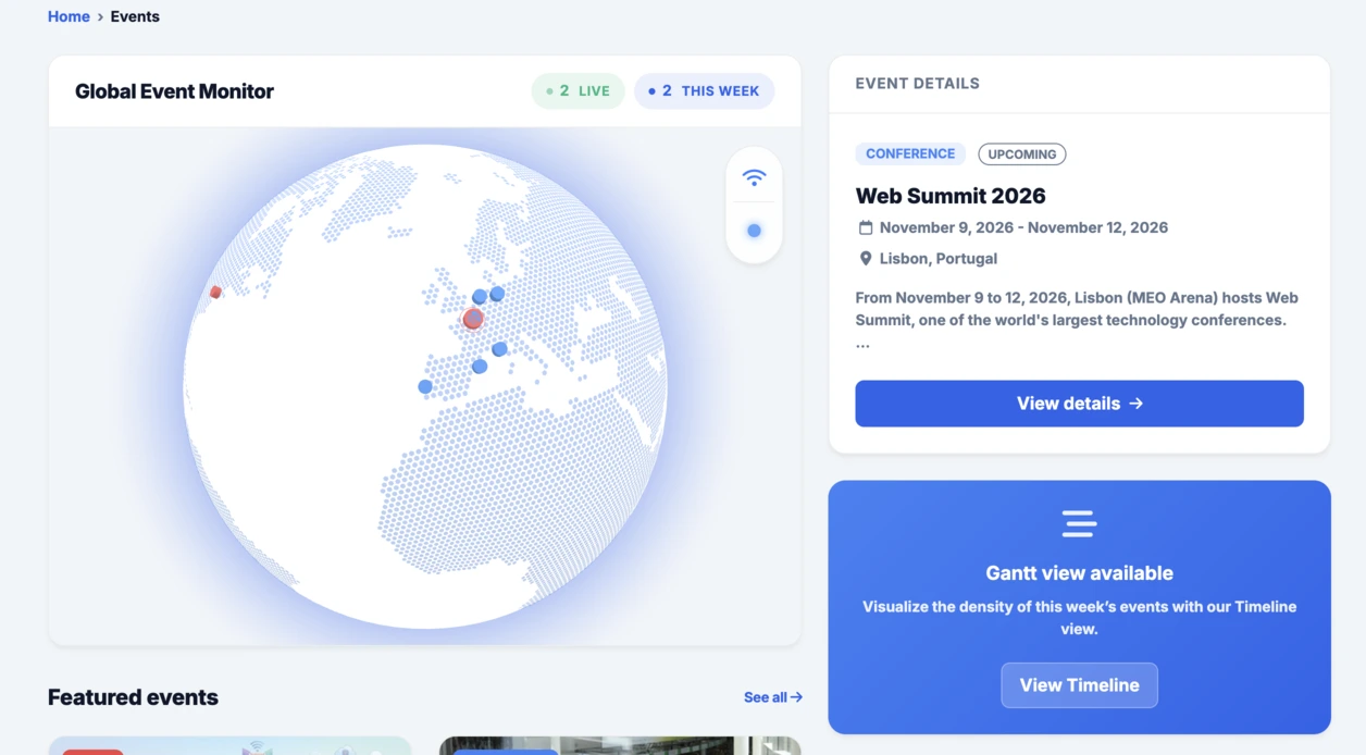
Po interaktywnym globie zintegrowanym z sekcją Events ten radialny dashboard dobrze kontynuuje tę samą logikę: szybko testować, konkretnie wizualizować, a następnie decydować, czy pomysł zasługuje na dalszy rozwój w ramach Linkeum.