Bu 15. Salı Promptu için amaç, hem faydalı hem de görsel olarak güçlü yeni bir arayüz türünü test etmekti: hayatın ana alanlarındaki hedefleri takip etmeye yönelik kişisel ilerleme dashboard’u.
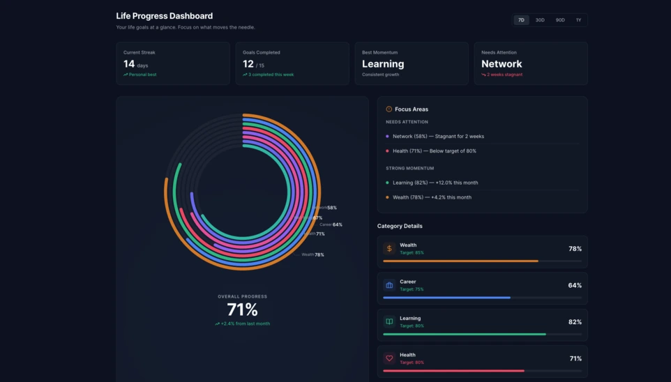
Linkeum’da Salı Promptları yalnızca görsel olarak etkileyici demolar üretmek için değil, bir gün ürünün gerçek parçalarına dönüşebilecek arayüzleri test etmek için de kullanılıyor. Bu 15. bölümde amaç, bir kullanıcının hayatının farklı boyutlarındaki ilerlemesini açık biçimde gösterebilen kişisel bir ilerleme dashboard’u oluşturmaktı.
Hedef, basit bir hedef listesinin ötesine geçmek ve okunabilir, modern ve daha ileri düzeyde keşfedilmeyi hak edecek kadar görsel olarak güçlü gerçek bir dashboard bileşeni hayal etmekti.
Kullanılan prompt
Bu kez prompt, doğrudan test edilebilen, kolayca ekran görüntüsü alınabilen ve ileride Linkeum içinde yeniden kullanılma potansiyeli olan bağımsız bir HTML dosyası elde etmek için code only modunda yazıldı.
Qwen’e gönderilen prompt şuydu:
Generate code only.
Create a single self-contained HTML file with embedded CSS and JavaScript that builds a premium “Life Progress Dashboard” for Linkeum.
GOAL
The dashboard must help a user track progress across the major areas of life based on personal goals.
This is not a landing page.
This is not a marketing page.
This is a real product dashboard section designed for daily use.MAIN VISUAL
Build a large multi-ring radial progress chart as the main hero visualization.
Use a free JavaScript charting library suitable for radial / circular progress visualization.
Prefer Apache ECharts.The chart must represent 8 life categories:
- Wealth
- Career
- Learning
- Health
- Network
- Personal Projects
- Discipline
- Well-being
Each category must have:
- a progress percentage,
- a target marker or target logic,
- a label,
- a distinct but refined visual treatment.
Use realistic sample values such as:
- Wealth: 78
- Career: 64
- Learning: 82
- Health: 71
- Network: 58
- Personal Projects: 69
- Discipline: 75
- Well-being: 67
At the center of the radial visualization, display:
- “Overall Progress”
- and a combined percentage, for example 71%
The radial chart should look elegant, structured, readable, and premium.
Do not make it look playful or gimmicky.
Do not create a chaotic radar chart.
Do not use a generic fitness-app aesthetic.LAYOUT
Create a full dashboard section around the chart with:
- A left or center main chart area.
- A right-side details panel with category cards.
- Small KPI cards above or below for:
- Current streak
- Goals completed this week
- Best momentum
- Needs attention
- A “Focus Areas” card listing:
- Top 2 categories falling behind
- Top 2 categories improving fastest
- Small trend indicators or mini progress bars in the detail cards.
DESIGN STYLE
The design must match a premium Linkeum-like style:
- deep navy background or navy-tinted surfaces
- lighter blue highlights
- subtle amber/gold accents
- clean white or off-white text
- modern, professional, executive-grade UI
- modern fintech + personal intelligence dashboard
Avoid:
- neon colors
- rainbow palettes
- glassmorphism overload
- generic startup hero sections
- excessive gradients
- cartoonish visuals
Use a refined design system with:
- modern spacing
- subtle borders
- soft shadows
- polished cards
- clean typography
- a strong visual hierarchy
TECHNICAL REQUIREMENTS
- Output only one HTML file
- Include all CSS and JavaScript inside the HTML
- Use CDN imports only if needed
- Prefer Apache ECharts via CDN
- The result must run immediately when saved as an .html file and opened in a browser
- No external assets except the chart library CDN and web fonts if needed
- No frameworks like React, Vue, or Tailwind
- Pure HTML, CSS, and JavaScript only
- Code must be clean, readable, and well-structured
RESPONSIVENESS
The dashboard must be responsive.
- On desktop: chart + side panel layout
- On mobile: stacked layout with excellent readability
- Maintain strong visual hierarchy on smaller screens
INTERACTION
Even if this is a static HTML demo, make the UI feel interactive:
- hover states on cards
- hover emphasis on chart areas if possible
- subtle animated loading for the chart
- filter tabs such as 7D / 30D / 90D / 1Y
- active state styling
CONTENT
Use realistic product-like copy, for example:
- “Your life goals at a glance”
- “Focus on what moves the needle”
- “2 categories need attention this week”
- “Momentum is strongest in Learning and Wealth”
QUALITY BAR
The result should look like a real product dashboard mockup that could be screenshotted for an article and potentially reused later in a real product.Do not explain anything.
Do not output markdown.
Do not wrap the code in triple backticks.
Output raw HTML only.
Sonuç
Qwen tarafından üretilen sonuç oldukça ikna edici bir temel sunuyor. Arayüz, merkezde yer alan büyük çok halkalı radyal grafik etrafında kurulmuş; buna KPI kartları, bir odak paneli ve kategori bazlı detay blokları eşlik ediyor.
Burada ilginç olan yalnızca görsel etki değil. Daha da önemlisi, yapay zekâ yeniden kullanılabilir ve güvenilir bir dashboard yapısı üretti; üstelik bu yapı, gelecekteki bir Linkeum modülünün temeli olacak kadar da temiz görünüyor.
Bu test neden önemli
Bu Salı Promptu, iyi bir promptun yalnızca etkileyici bir demo üretmekten fazlasını yapabileceğini gösteriyor. Aynı zamanda açık bir mantığa, tutarlı bir hiyerarşiye ve orta vadeli potansiyele sahip gerçek bir ürün arayüzünü hızlıca prototiplemeye de yardımcı olabilir.
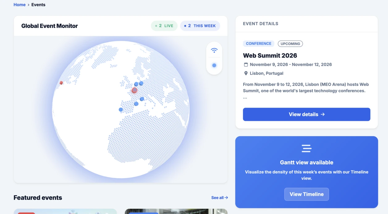
Events bölümüne entegre edilen etkileşimli küreden sonra bu radyal dashboard da aynı mantığı iyi şekilde sürdürüyor: hızlı test etmek, somut biçimde görselleştirmek ve ardından fikrin Linkeum içinde daha ileri götürülmeye değer olup olmadığına karar vermek.