在第 15 期星期二 Prompt 中,我们想测试一种既实用又具有强烈视觉效果的新界面:一个用于追踪人生主要目标进展的个人仪表盘。
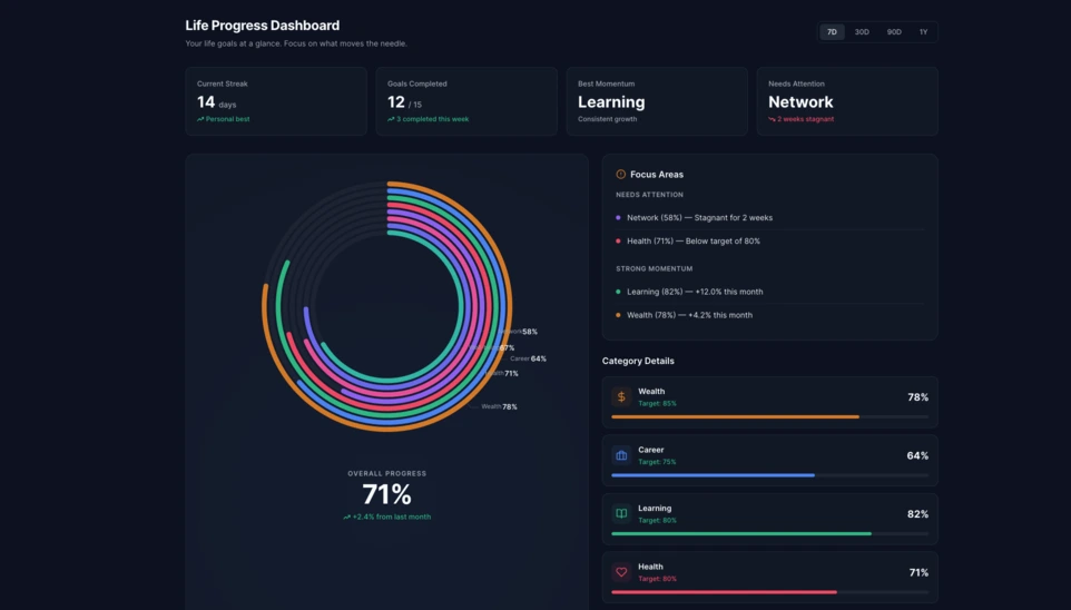
在 Linkeum,星期二 Prompt 的目的不只是做出好看的演示,而是测试那些未来有可能成为真实产品模块的界面。第 15 期的想法,就是生成一个个人进度仪表盘,用来清晰展示用户在人生多个维度上的进展。
目标是跳出传统的目标清单形式,去构思一个真正的仪表盘组件:它既要清晰易读、现代,也要在视觉上足够有冲击力,值得进一步探索。
使用的提示词
这一次,提示词被写成了 code only 模式,以便直接得到一个完全独立的 HTML 文件,方便测试、截图,也有可能在之后被重新用于 Linkeum。
提交给 Qwen 的提示词如下:
Generate code only.
Create a single self-contained HTML file with embedded CSS and JavaScript that builds a premium “Life Progress Dashboard” for Linkeum.
GOAL
The dashboard must help a user track progress across the major areas of life based on personal goals.
This is not a landing page.
This is not a marketing page.
This is a real product dashboard section designed for daily use.MAIN VISUAL
Build a large multi-ring radial progress chart as the main hero visualization.
Use a free JavaScript charting library suitable for radial / circular progress visualization.
Prefer Apache ECharts.The chart must represent 8 life categories:
- Wealth
- Career
- Learning
- Health
- Network
- Personal Projects
- Discipline
- Well-being
Each category must have:
- a progress percentage,
- a target marker or target logic,
- a label,
- a distinct but refined visual treatment.
Use realistic sample values such as:
- Wealth: 78
- Career: 64
- Learning: 82
- Health: 71
- Network: 58
- Personal Projects: 69
- Discipline: 75
- Well-being: 67
At the center of the radial visualization, display:
- “Overall Progress”
- and a combined percentage, for example 71%
The radial chart should look elegant, structured, readable, and premium.
Do not make it look playful or gimmicky.
Do not create a chaotic radar chart.
Do not use a generic fitness-app aesthetic.LAYOUT
Create a full dashboard section around the chart with:
- A left or center main chart area.
- A right-side details panel with category cards.
- Small KPI cards above or below for:
- Current streak
- Goals completed this week
- Best momentum
- Needs attention
- A “Focus Areas” card listing:
- Top 2 categories falling behind
- Top 2 categories improving fastest
- Small trend indicators or mini progress bars in the detail cards.
DESIGN STYLE
The design must match a premium Linkeum-like style:
- deep navy background or navy-tinted surfaces
- lighter blue highlights
- subtle amber/gold accents
- clean white or off-white text
- modern, professional, executive-grade UI
- modern fintech + personal intelligence dashboard
Avoid:
- neon colors
- rainbow palettes
- glassmorphism overload
- generic startup hero sections
- excessive gradients
- cartoonish visuals
Use a refined design system with:
- modern spacing
- subtle borders
- soft shadows
- polished cards
- clean typography
- a strong visual hierarchy
TECHNICAL REQUIREMENTS
- Output only one HTML file
- Include all CSS and JavaScript inside the HTML
- Use CDN imports only if needed
- Prefer Apache ECharts via CDN
- The result must run immediately when saved as an .html file and opened in a browser
- No external assets except the chart library CDN and web fonts if needed
- No frameworks like React, Vue, or Tailwind
- Pure HTML, CSS, and JavaScript only
- Code must be clean, readable, and well-structured
RESPONSIVENESS
The dashboard must be responsive.
- On desktop: chart + side panel layout
- On mobile: stacked layout with excellent readability
- Maintain strong visual hierarchy on smaller screens
INTERACTION
Even if this is a static HTML demo, make the UI feel interactive:
- hover states on cards
- hover emphasis on chart areas if possible
- subtle animated loading for the chart
- filter tabs such as 7D / 30D / 90D / 1Y
- active state styling
CONTENT
Use realistic product-like copy, for example:
- “Your life goals at a glance”
- “Focus on what moves the needle”
- “2 categories need attention this week”
- “Momentum is strongest in Learning and Wealth”
QUALITY BAR
The result should look like a real product dashboard mockup that could be screenshotted for an article and potentially reused later in a real product.Do not explain anything.
Do not output markdown.
Do not wrap the code in triple backticks.
Output raw HTML only.
结果
Qwen 生成的结果是一个非常有说服力的基础版本。整个界面围绕一个位于中心的大型多环放射图构建,同时配有 KPI 卡片、重点面板以及按类别拆分的详情模块。
真正有意思的地方并不只是视觉效果。更重要的是,AI 生成了一个可信、可复用的仪表盘结构,而且已经足够整洁,可以作为 Linkeum 未来某个模块的基础。
为什么这个测试值得关注
这一次的星期二 Prompt 说明,一个好的提示词不仅能产出令人印象深刻的演示,还能快速原型化一个真正的产品界面,具备清晰的逻辑、连贯的层级,以及中期可继续推进的潜力。
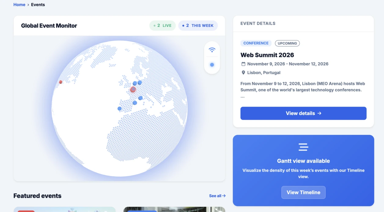
继此前被整合进 Events 栏目的交互式地球之后,这个放射式仪表盘延续了同样的思路:快速测试、直观看到结果,然后再判断这个想法是否值得在 Linkeum 中继续深入。