В този 15-и Вторнишки промпт идеята беше да се тества нов тип полезен и визуално силен интерфейс: dashboard за личен напредък за следене на цели в основните области на живота.
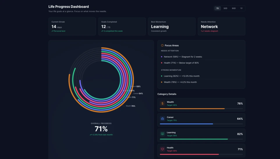
В Linkeum Вторнишките промпти не се използват само за създаване на визуално впечатляващи демо версии, но и за тестване на интерфейси, които един ден могат да станат реални части от продукта. В това 15-о издание идеята беше да се генерира dashboard за личен напредък, способен ясно да показва развитието на даден потребител в няколко измерения на живота му.
Целта беше да се излезе отвъд обикновен списък с цели и да се представи реален dashboard компонент, който да бъде четим, модерен и достатъчно силен визуално, за да заслужава по-нататъшно развитие.
Използваният prompt
Този път promptът беше написан в режим code only, за да се получи директно самостоятелен HTML файл, който е лесен за тестване, лесен за заснемане като screenshot и потенциално може да бъде използван повторно по-късно в Linkeum.
Promptът, изпратен към Qwen, беше следният:
Generate code only.
Create a single self-contained HTML file with embedded CSS and JavaScript that builds a premium “Life Progress Dashboard” for Linkeum.
GOAL
The dashboard must help a user track progress across the major areas of life based on personal goals.
This is not a landing page.
This is not a marketing page.
This is a real product dashboard section designed for daily use.MAIN VISUAL
Build a large multi-ring radial progress chart as the main hero visualization.
Use a free JavaScript charting library suitable for radial / circular progress visualization.
Prefer Apache ECharts.The chart must represent 8 life categories:
- Wealth
- Career
- Learning
- Health
- Network
- Personal Projects
- Discipline
- Well-being
Each category must have:
- a progress percentage,
- a target marker or target logic,
- a label,
- a distinct but refined visual treatment.
Use realistic sample values such as:
- Wealth: 78
- Career: 64
- Learning: 82
- Health: 71
- Network: 58
- Personal Projects: 69
- Discipline: 75
- Well-being: 67
At the center of the radial visualization, display:
- “Overall Progress”
- and a combined percentage, for example 71%
The radial chart should look elegant, structured, readable, and premium.
Do not make it look playful or gimmicky.
Do not create a chaotic radar chart.
Do not use a generic fitness-app aesthetic.LAYOUT
Create a full dashboard section around the chart with:
- A left or center main chart area.
- A right-side details panel with category cards.
- Small KPI cards above or below for:
- Current streak
- Goals completed this week
- Best momentum
- Needs attention
- A “Focus Areas” card listing:
- Top 2 categories falling behind
- Top 2 categories improving fastest
- Small trend indicators or mini progress bars in the detail cards.
DESIGN STYLE
The design must match a premium Linkeum-like style:
- deep navy background or navy-tinted surfaces
- lighter blue highlights
- subtle amber/gold accents
- clean white or off-white text
- modern, professional, executive-grade UI
- modern fintech + personal intelligence dashboard
Avoid:
- neon colors
- rainbow palettes
- glassmorphism overload
- generic startup hero sections
- excessive gradients
- cartoonish visuals
Use a refined design system with:
- modern spacing
- subtle borders
- soft shadows
- polished cards
- clean typography
- a strong visual hierarchy
TECHNICAL REQUIREMENTS
- Output only one HTML file
- Include all CSS and JavaScript inside the HTML
- Use CDN imports only if needed
- Prefer Apache ECharts via CDN
- The result must run immediately when saved as an .html file and opened in a browser
- No external assets except the chart library CDN and web fonts if needed
- No frameworks like React, Vue, or Tailwind
- Pure HTML, CSS, and JavaScript only
- Code must be clean, readable, and well-structured
RESPONSIVENESS
The dashboard must be responsive.
- On desktop: chart + side panel layout
- On mobile: stacked layout with excellent readability
- Maintain strong visual hierarchy on smaller screens
INTERACTION
Even if this is a static HTML demo, make the UI feel interactive:
- hover states on cards
- hover emphasis on chart areas if possible
- subtle animated loading for the chart
- filter tabs such as 7D / 30D / 90D / 1Y
- active state styling
CONTENT
Use realistic product-like copy, for example:
- “Your life goals at a glance”
- “Focus on what moves the needle”
- “2 categories need attention this week”
- “Momentum is strongest in Learning and Wealth”
QUALITY BAR
The result should look like a real product dashboard mockup that could be screenshotted for an article and potentially reused later in a real product.Do not explain anything.
Do not output markdown.
Do not wrap the code in triple backticks.
Output raw HTML only.
Резултатът
Резултатът, който Qwen генерира, представлява много убедителна основа. Интерфейсът е изграден около голяма многопръстенна радиална графика в центъра, придружена от KPI карти, focus панел и блокове с детайли за всяка категория.
Това, което прави теста интересен, не е само визуалният ефект. Още по-важно е, че AI създаде достоверна и преизползваема dashboard структура, която вече е достатъчно изчистена, за да служи като основа за бъдещ модул на Linkeum.
Защо този тест е важен
Този Вторнишки промпт показва, че един добър prompt може да създаде нещо повече от впечатляващо демо. Той може също така да помогне за бързо прототипиране на реален продуктов интерфейс с ясна логика, последователна йерархия и потенциална стойност в средносрочен план.
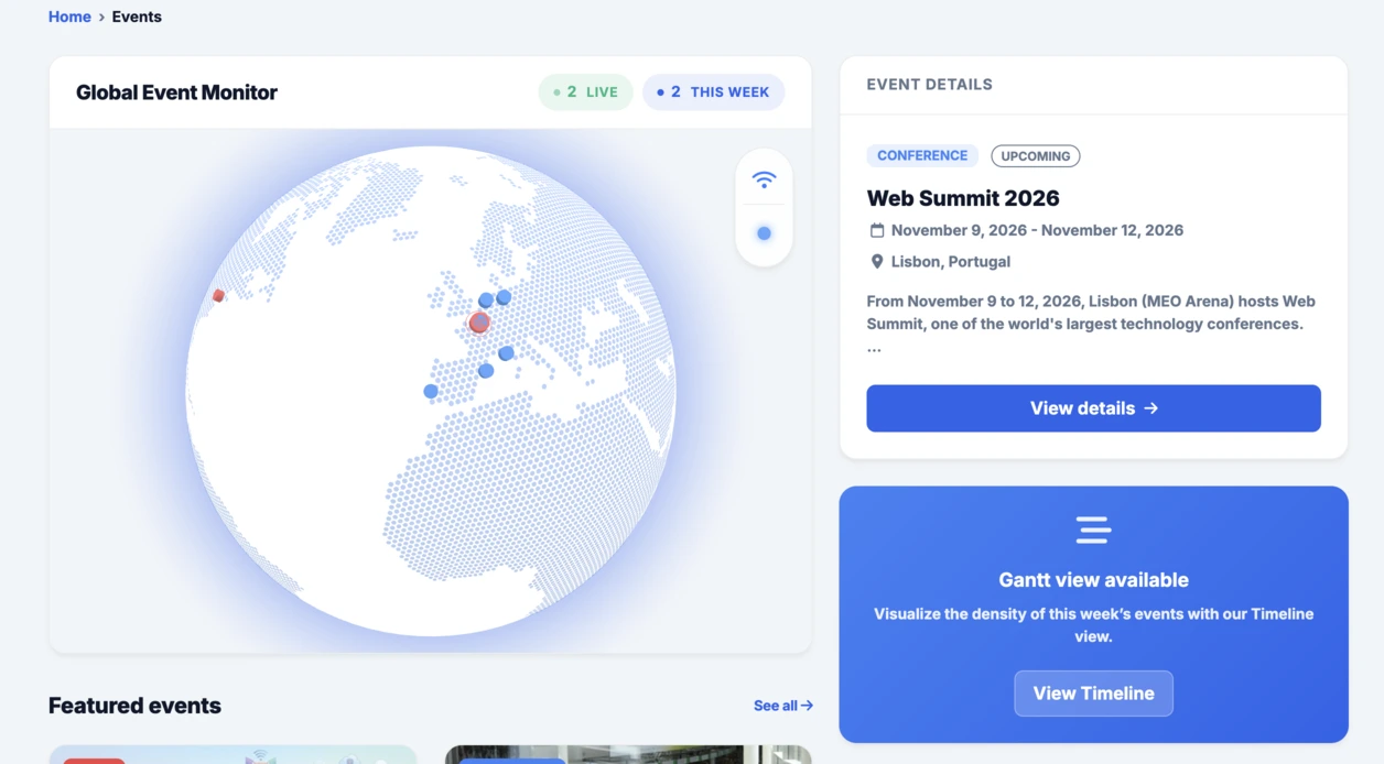
След интерактивния глобус, интегриран в секцията Events, това радиално dashboard решение продължава много добре същата логика: бързо тестване, конкретна визуализация и след това решение дали идеята заслужава по-нататъшно развитие в рамките на Linkeum.