در این پانزدهمین پرامپت سهشنبه، ایده این بود که نوع تازهای از رابط کاربردی و از نظر بصری قدرتمند آزمایش شود: یک داشبورد پیشرفت شخصی برای پیگیری اهداف در مهمترین جنبههای زندگی.
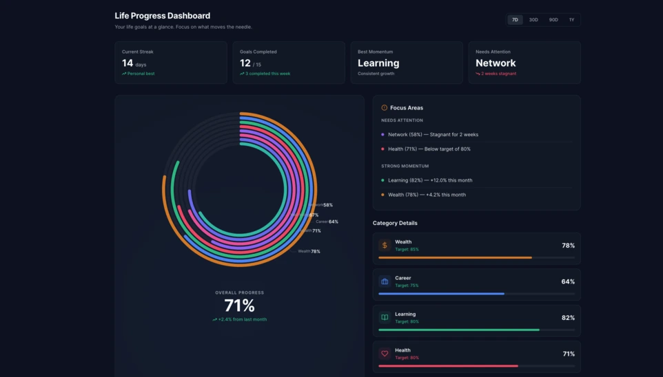
در Linkeum، پرامپتهای سهشنبه فقط برای ساخت دموهای چشمنواز نیستند، بلکه برای آزمایش رابطهایی هم به کار میروند که ممکن است روزی به بخشهای واقعی محصول تبدیل شوند. در این پانزدهمین نسخه، ایده این بود که یک داشبورد پیشرفت شخصی تولید شود که بتواند پیشرفت کاربر را در چندین بُعد از زندگیاش بهصورت روشن نشان دهد.
هدف این بود که از یک فهرست ساده از اهداف فراتر برویم و یک مؤلفه واقعی برای داشبورد تصور کنیم که خوانا، مدرن و از نظر بصری بهاندازه کافی قوی باشد تا ارزش بررسی بیشتر را داشته باشد.
پرامپت استفادهشده
این بار پرامپت در حالت code only نوشته شد تا مستقیماً یک فایل HTML مستقل به دست آید؛ فایلی که آزمایش آن آسان باشد، گرفتن اسکرینشات از آن راحت باشد و بعداً هم شاید بتوان از آن دوباره در Linkeum استفاده کرد.
پرامپتی که برای Qwen ارسال شد، این بود:
Generate code only.
Create a single self-contained HTML file with embedded CSS and JavaScript that builds a premium “Life Progress Dashboard” for Linkeum.
GOAL
The dashboard must help a user track progress across the major areas of life based on personal goals.
This is not a landing page.
This is not a marketing page.
This is a real product dashboard section designed for daily use.MAIN VISUAL
Build a large multi-ring radial progress chart as the main hero visualization.
Use a free JavaScript charting library suitable for radial / circular progress visualization.
Prefer Apache ECharts.The chart must represent 8 life categories:
- Wealth
- Career
- Learning
- Health
- Network
- Personal Projects
- Discipline
- Well-being
Each category must have:
- a progress percentage,
- a target marker or target logic,
- a label,
- a distinct but refined visual treatment.
Use realistic sample values such as:
- Wealth: 78
- Career: 64
- Learning: 82
- Health: 71
- Network: 58
- Personal Projects: 69
- Discipline: 75
- Well-being: 67
At the center of the radial visualization, display:
- “Overall Progress”
- and a combined percentage, for example 71%
The radial chart should look elegant, structured, readable, and premium.
Do not make it look playful or gimmicky.
Do not create a chaotic radar chart.
Do not use a generic fitness-app aesthetic.LAYOUT
Create a full dashboard section around the chart with:
- A left or center main chart area.
- A right-side details panel with category cards.
- Small KPI cards above or below for:
- Current streak
- Goals completed this week
- Best momentum
- Needs attention
- A “Focus Areas” card listing:
- Top 2 categories falling behind
- Top 2 categories improving fastest
- Small trend indicators or mini progress bars in the detail cards.
DESIGN STYLE
The design must match a premium Linkeum-like style:
- deep navy background or navy-tinted surfaces
- lighter blue highlights
- subtle amber/gold accents
- clean white or off-white text
- modern, professional, executive-grade UI
- modern fintech + personal intelligence dashboard
Avoid:
- neon colors
- rainbow palettes
- glassmorphism overload
- generic startup hero sections
- excessive gradients
- cartoonish visuals
Use a refined design system with:
- modern spacing
- subtle borders
- soft shadows
- polished cards
- clean typography
- a strong visual hierarchy
TECHNICAL REQUIREMENTS
- Output only one HTML file
- Include all CSS and JavaScript inside the HTML
- Use CDN imports only if needed
- Prefer Apache ECharts via CDN
- The result must run immediately when saved as an .html file and opened in a browser
- No external assets except the chart library CDN and web fonts if needed
- No frameworks like React, Vue, or Tailwind
- Pure HTML, CSS, and JavaScript only
- Code must be clean, readable, and well-structured
RESPONSIVENESS
The dashboard must be responsive.
- On desktop: chart + side panel layout
- On mobile: stacked layout with excellent readability
- Maintain strong visual hierarchy on smaller screens
INTERACTION
Even if this is a static HTML demo, make the UI feel interactive:
- hover states on cards
- hover emphasis on chart areas if possible
- subtle animated loading for the chart
- filter tabs such as 7D / 30D / 90D / 1Y
- active state styling
CONTENT
Use realistic product-like copy, for example:
- “Your life goals at a glance”
- “Focus on what moves the needle”
- “2 categories need attention this week”
- “Momentum is strongest in Learning and Wealth”
QUALITY BAR
The result should look like a real product dashboard mockup that could be screenshotted for an article and potentially reused later in a real product.Do not explain anything.
Do not output markdown.
Do not wrap the code in triple backticks.
Output raw HTML only.
نتیجه
نتیجهای که Qwen تولید کرد، یک پایه بسیار متقاعدکننده است. این رابط بر یک نمودار رادیال بزرگ چندحلقهای در مرکز تکیه دارد و با کارتهای KPI، یک پنل تمرکز و بلوکهای جزئیات برای هر دسته همراه شده است.
آنچه این آزمایش را جالب میکند، فقط جلوه بصری آن نیست. مهمتر از آن، هوش مصنوعی یک ساختار داشبورد معتبر و قابل استفاده مجدد تولید کرده که همین حالا هم بهاندازه کافی تمیز و منظم است تا بهعنوان پایهای برای یک ماژول آینده در Linkeum به کار برود.
چرا این آزمایش مهم است
این پرامپت سهشنبه نشان میدهد که یک پرامپت خوب میتواند چیزی فراتر از یک دمو چشمگیر تولید کند. چنین پرامپتی میتواند به ساخت سریع نمونه اولیه یک رابط محصول واقعی هم کمک کند؛ با منطق روشن، سلسلهمراتب منسجم و ارزش بالقوه در میانمدت.
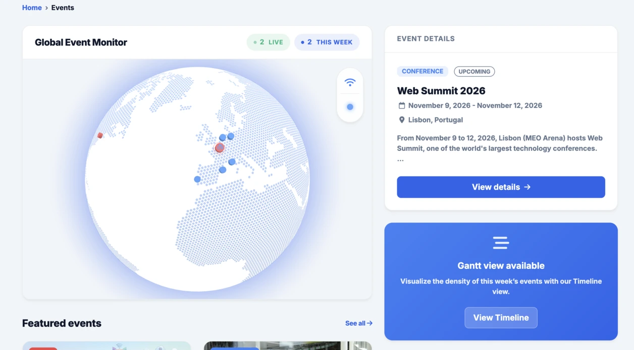
بعد از کره تعاملی که در بخش Events ادغام شد، این داشبورد رادیال هم همان منطق را بهخوبی ادامه میدهد: سریع آزمایش کردن، بهصورت ملموس تصویرسازی کردن، و بعد تصمیم گرفتن که آیا این ایده ارزش توسعه بیشتر در Linkeum را دارد یا نه.