今回の第15回火曜プロンプトでは、実用的で視覚的にも強い新しいインターフェースを試すことが目的でした。人生の主要分野における目標を追跡するための個人進捗ダッシュボードです。
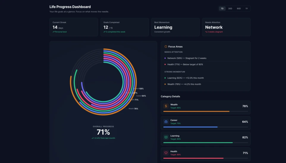
Linkeum の火曜プロンプトは、見た目の良いデモを作るためだけのものではなく、将来的に本当のプロダクト機能になり得るインターフェースを試すためにも使われています。今回の第15回では、ユーザーの人生の複数の側面における進捗をわかりやすく表示できる、個人進捗ダッシュボードを生成することがテーマでした。
狙いは、単なる目標リストを超えて、読みやすく、モダンで、さらに深く検討する価値があるほど視覚的にも強い、本物のダッシュボードコンポーネントを構想することでした。
使用したプロンプト
今回は code only モードでプロンプトを書き、すぐにテストできて、スクリーンショットも撮りやすく、将来的には Linkeum の中で再利用できる可能性のある、単独の HTML ファイルを直接得ることを目指しました。
Qwen に送ったプロンプトは次のとおりです。
Generate code only.
Create a single self-contained HTML file with embedded CSS and JavaScript that builds a premium “Life Progress Dashboard” for Linkeum.
GOAL
The dashboard must help a user track progress across the major areas of life based on personal goals.
This is not a landing page.
This is not a marketing page.
This is a real product dashboard section designed for daily use.MAIN VISUAL
Build a large multi-ring radial progress chart as the main hero visualization.
Use a free JavaScript charting library suitable for radial / circular progress visualization.
Prefer Apache ECharts.The chart must represent 8 life categories:
- Wealth
- Career
- Learning
- Health
- Network
- Personal Projects
- Discipline
- Well-being
Each category must have:
- a progress percentage,
- a target marker or target logic,
- a label,
- a distinct but refined visual treatment.
Use realistic sample values such as:
- Wealth: 78
- Career: 64
- Learning: 82
- Health: 71
- Network: 58
- Personal Projects: 69
- Discipline: 75
- Well-being: 67
At the center of the radial visualization, display:
- “Overall Progress”
- and a combined percentage, for example 71%
The radial chart should look elegant, structured, readable, and premium.
Do not make it look playful or gimmicky.
Do not create a chaotic radar chart.
Do not use a generic fitness-app aesthetic.LAYOUT
Create a full dashboard section around the chart with:
- A left or center main chart area.
- A right-side details panel with category cards.
- Small KPI cards above or below for:
- Current streak
- Goals completed this week
- Best momentum
- Needs attention
- A “Focus Areas” card listing:
- Top 2 categories falling behind
- Top 2 categories improving fastest
- Small trend indicators or mini progress bars in the detail cards.
DESIGN STYLE
The design must match a premium Linkeum-like style:
- deep navy background or navy-tinted surfaces
- lighter blue highlights
- subtle amber/gold accents
- clean white or off-white text
- modern, professional, executive-grade UI
- modern fintech + personal intelligence dashboard
Avoid:
- neon colors
- rainbow palettes
- glassmorphism overload
- generic startup hero sections
- excessive gradients
- cartoonish visuals
Use a refined design system with:
- modern spacing
- subtle borders
- soft shadows
- polished cards
- clean typography
- a strong visual hierarchy
TECHNICAL REQUIREMENTS
- Output only one HTML file
- Include all CSS and JavaScript inside the HTML
- Use CDN imports only if needed
- Prefer Apache ECharts via CDN
- The result must run immediately when saved as an .html file and opened in a browser
- No external assets except the chart library CDN and web fonts if needed
- No frameworks like React, Vue, or Tailwind
- Pure HTML, CSS, and JavaScript only
- Code must be clean, readable, and well-structured
RESPONSIVENESS
The dashboard must be responsive.
- On desktop: chart + side panel layout
- On mobile: stacked layout with excellent readability
- Maintain strong visual hierarchy on smaller screens
INTERACTION
Even if this is a static HTML demo, make the UI feel interactive:
- hover states on cards
- hover emphasis on chart areas if possible
- subtle animated loading for the chart
- filter tabs such as 7D / 30D / 90D / 1Y
- active state styling
CONTENT
Use realistic product-like copy, for example:
- “Your life goals at a glance”
- “Focus on what moves the needle”
- “2 categories need attention this week”
- “Momentum is strongest in Learning and Wealth”
QUALITY BAR
The result should look like a real product dashboard mockup that could be screenshotted for an article and potentially reused later in a real product.Do not explain anything.
Do not output markdown.
Do not wrap the code in triple backticks.
Output raw HTML only.
結果
Qwen が生成した結果は、とても説得力のある土台になっています。インターフェースは中央の大きな多層ラジアルチャートを中心に構成されており、KPIカード、フォーカスパネル、カテゴリごとの詳細ブロックが組み合わされています。
ここで面白いのは、単なる見た目のインパクトだけではありません。より重要なのは、AI が信頼できて再利用可能なダッシュボード構造を生成しており、すでに Linkeum の将来モジュールの土台として使えるほど整理されていることです。
なぜこのテストが重要なのか
今回の火曜プロンプトは、良いプロンプトが単に印象的なデモ以上のものを生み出せることを示しています。明確なロジック、一貫した階層、そして中期的な価値の可能性を備えた、本物のプロダクトインターフェースのプロトタイプを素早く作ることにも役立つのです。
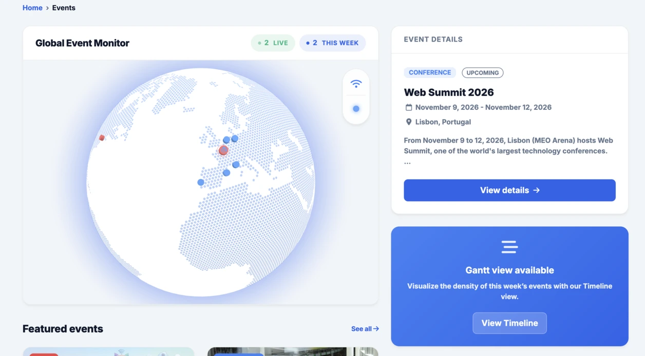
Events セクションに統合されたインタラクティブな地球儀に続いて、このラジアルダッシュボードも同じ流れをうまく引き継いでいます。すばやく試し、具体的に可視化し、そのうえで Linkeum の中でさらに発展させる価値があるかを判断する、という考え方です。