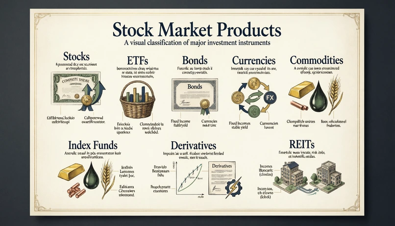
在本期周二提示词 #12 中,我们希望打破金融的视觉常规。目标是什么?要求 AI 设计一张看起来像豪华百科全书或博物馆图谱的金融市场信息图。
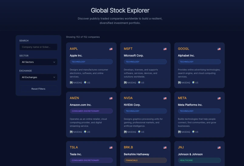
金融在视觉上往往显得枯燥乏味。在拥挤的仪表板和穿着西装握手的男士照片之间,很难找到原创的形式来解释投资。
对于本期周二提示词 #12,我们希望在 Linkeum 上探索一种不同的图形方向:将股市产品(股票、ETF、债券……)的分类转化为真正的艺术品,介于现代社论信息图和复古植物图谱之间。
使用的提示词
为了获得这个结果,同时避免 AI 绘制真实的植物或树叶,我们必须在艺术指导上非常明确。该提示词是用英语编写的,特别注重“高级(premium)”风格。
Act as an expert editorial designer, infographic art director, and premium finance visual specialist.
Create a highly detailed 16:9 landscape infographic poster about major stock market product categories. The image must look like a refined scientific wall chart or a museum-quality educational poster, not like a botanical herbarium with real plants.
Subject: The poster explains the main families of financial market products in a beautiful, visual, structured way (Stocks, ETFs, Bonds, Currencies, Commodities, Index Funds, Derivatives, REITs).
Art direction:
- Premium, elegant, high-end fintech aesthetic
- A sophisticated editorial infographic, halfway between a vintage scientific plate and a modern financial poster
- Clean composition, balanced spacing, beautiful hierarchy, visually rich but not cluttered
- No real plants, no flowers, no leaves, no herbarium specimens
- Use symbolic visual metaphors, icons, miniature diagrams, category frames, subtle connectors, elegant labels, and classification logic
- Refined cream, ivory, soft charcoal, deep navy, muted gold, and subtle green palette
- Crisp typography, elegant headings, small annotations, fine linework
- Luxurious paper texture or premium poster texture
- A modern-finance-meets-scientific-atlas mood
Optional enhancement: Make the poster feel like a rare “Atlas of Financial Instruments” plate, as if it belonged to a collector’s encyclopedia of global finance. The composition should be artistic, precise, and highly curated.
为什么这个提示词很有趣
这个提示词的主要技巧在于最后的“Optional enhancement(可选增强)”模块。通过明确要求 AI 模仿收藏家拥有的“金融工具图谱”,我们迫使它采用一种极其结构化、豪华和一丝不苟的构图,这与 Linkeum 的高端基因完美契合。
此外,负面约束列表(“没有真实的植物,没有花……”)至关重要:一旦使用“复古”或“百科全书”等词,AI 就有绘制自然元素的反射。在这里,我们强迫它使用纯粹的概念隐喻。
结果……以及文本挑战!
AI 生成的视觉渲染非常棒:构图平衡,色彩优雅(奶油色、海军蓝、金色),整体氛围立即赋予原本非常技术性的概念一种“高端”的感觉。
然而,这张原始图像凸显了当前生成式 AI 最大的局限性:处理小文本。仔细观察标签和箭头,生成的文本看起来像难以辨认的外星字母!
适合您设计的“专业”方法
这是一次失败吗?绝对不是!在网页设计领域,AI 被用来创建“背景”,而不是最终的排版。
最好的方法是保留 Qwen 生成的这个华丽构图,将其导入 Canva、Figma 或 Photoshop 等工具中,并使用清晰的排版用您自己语言的文本框覆盖 AI 的假文本。这样您就能两全其美:AI 的艺术力量和人类的编辑严谨性!