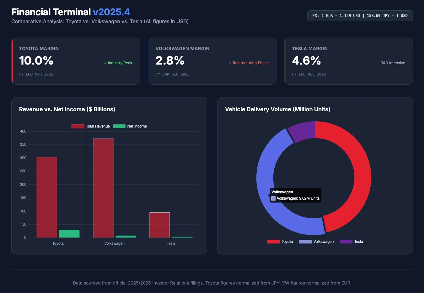
本周,我们将全新的金融版块与人工智能的力量结合起来。挑战是什么?要求 AI 分析三大汽车巨头(丰田、大众、特斯拉)的业绩,转换各自的货币,并一键生成交互式可视化仪表板。
公司的基本面分析需要耗费大量时间,尤其是当您想要比较那些不以相同货币发布财报的跨国公司时。分析师必须搜索年度报告,筛选出正确的关键绩效指标(KPI),转换货币,最后制作出图表。
对于这第 5 个“周二提示词”,我们要求人工智能模型(在本例中为 Gemini)代替我们完成所有这些研究、数据标准化和网页开发工作。
今天的用例:比较 丰田 (Toyota)(日本)、大众 (Volkswagen)(德国)和 特斯拉 (Tesla)(美国)在 2025 年的业绩。
本周提示词
以下是我们使用的提示词(指令)。为了避免 AI 产生幻觉(即捏造数字),我们直接向它提供了这三家汽车制造商官方投资者关系页面的链接。
欢迎复制此提示词,在 Perplexity、Copilot 或 Gemini(具有网络访问权限)中运行它,并更改公司名称以适应您自己的投资需求!
Act as an expert financial analyst and UI/UX developer. I need to compare the latest full-year financial results of three major automakers: Toyota, Volkswagen, and Tesla.
Step 1: Data Gathering & Normalization Use your web-browsing capabilities to visit the official Investor Relations pages for each company:
- Toyota: https://global.toyota/en/ir/
- Volkswagen: https://www.volkswagen-group.com/en/investor-relations-15698
- Tesla: https://ir.tesla.com/
Extract the latest full-year data (2025) for these 4 KPIs:
- Total Revenue
- Net Income
- Operating Margin (%)
- Total Vehicles Delivered/Sold
Convert all financial figures (Yen for Toyota, Euro for VW) into US Dollars (USD) using the current exchange rate so the comparison is fair and accurate.
Step 2: Infographic Dashboard Generation Generate a beautiful, modern, single-file HTML dashboard to visualize this comparison.
- Use Tailwind CSS (via CDN) for the styling. Make it look like a premium financial terminal (dark mode).
- Use Chart.js (via CDN) to create two animated charts:
- A Bar Chart comparing "Revenue vs. Net Income" side-by-side for the 3 brands.
- A Doughnut Chart showing the market share based on "Total Vehicles Delivered".
- Create 3 stylish "Metric Cards" at the top of the dashboard displaying the Operating Margin (%) for each brand, using their respective brand colors (Red for Toyota, Blue for VW, Dark Grey for Tesla).
Output ONLY the complete, working HTML code so I can copy, paste, and render it immediately in my web browser.
最终结果
我们没有向您展示生成的冗长 HTML 和 Javascript 代码,而是直接在浏览器中渲染了代码并截取了屏幕截图。您在文章顶部看到的渲染图就是由 AI 生成的。
一次性生成的代码非常整洁,在视觉上,渲染效果简洁且非常专业。我只需手动调整几个十六进制颜色代码,以提高可见性和颜色的一致性。
关于 AI 生成的财务数据的关键说明
这次测试最令人印象深刻的一点在于最终的数字。在这次练习中,AI 做到了真正的“零失误”。 它准确提取了这三个集团 2025 年终资产负债表的数据(例如特斯拉 948.3 亿美元的收入),并完美地将欧元和日元在数学上转换为美元,甚至还显示了所使用的汇率以便我们核对。
然而,一条黄金法则依然适用:始终核实所生成的数字。人工智能在处理数字数据时可能会产生幻觉,尤其是当它们扫描复杂的 PDF 文档时。因此,在做出任何投资决定之前,如有疑问,务必亲自查阅官方发布的报告,这一点至关重要。