이번 15번째 화요 프롬프트에서는 실용적이면서도 시각적으로 강한 새로운 형태의 인터페이스를 시험해보는 것이 목표였습니다. 삶의 주요 영역에서의 목표를 추적하는 개인 진행 상황 대시보드입니다.
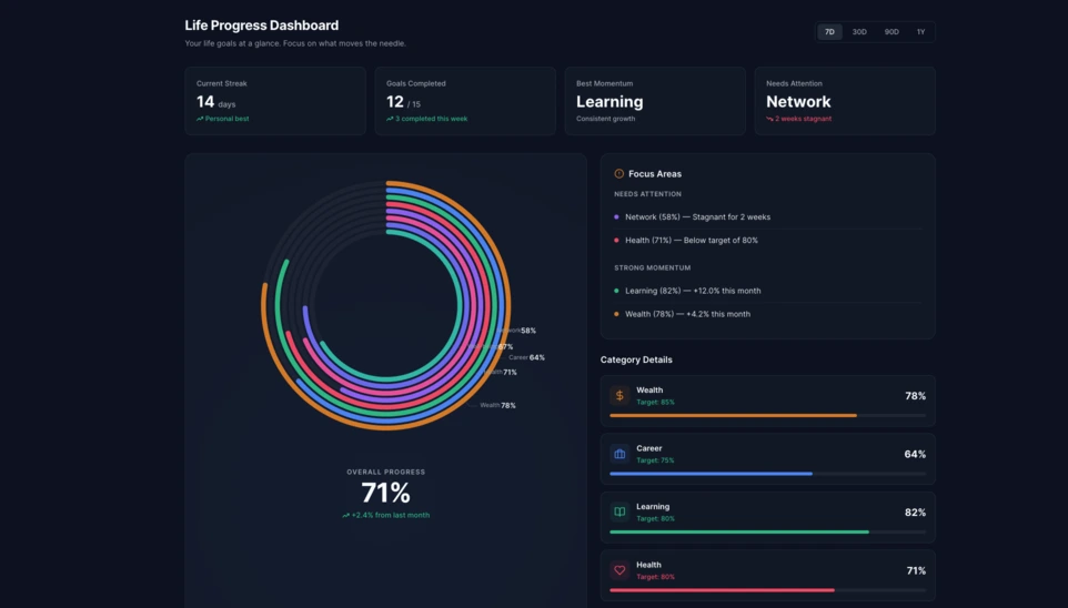
Linkeum의 화요 프롬프트는 보기 좋은 데모를 만드는 데만 쓰이는 것이 아니라, 언젠가 실제 제품의 일부가 될 수 있는 인터페이스를 실험하는 데에도 사용됩니다. 이번 15번째 에디션에서는 사용자의 삶의 여러 차원에서의 진행 상황을 명확하게 보여줄 수 있는 개인 진행 상황 대시보드를 생성하는 것이 목표였습니다.
단순한 목표 목록을 넘어서, 가독성이 높고 현대적이며 더 깊이 탐색할 가치가 있을 만큼 시각적으로도 강한 실제 대시보드 컴포넌트를 상상하는 것이 핵심이었습니다.
사용한 프롬프트
이번에는 code only 모드로 프롬프트를 작성해, 바로 테스트할 수 있고 스크린샷을 찍기 쉬우며 나중에 Linkeum 내부에서 다시 활용할 수도 있는 독립형 HTML 파일을 직접 얻고자 했습니다.
Qwen에 전달한 프롬프트는 다음과 같습니다.
Generate code only.
Create a single self-contained HTML file with embedded CSS and JavaScript that builds a premium “Life Progress Dashboard” for Linkeum.
GOAL
The dashboard must help a user track progress across the major areas of life based on personal goals.
This is not a landing page.
This is not a marketing page.
This is a real product dashboard section designed for daily use.MAIN VISUAL
Build a large multi-ring radial progress chart as the main hero visualization.
Use a free JavaScript charting library suitable for radial / circular progress visualization.
Prefer Apache ECharts.The chart must represent 8 life categories:
- Wealth
- Career
- Learning
- Health
- Network
- Personal Projects
- Discipline
- Well-being
Each category must have:
- a progress percentage,
- a target marker or target logic,
- a label,
- a distinct but refined visual treatment.
Use realistic sample values such as:
- Wealth: 78
- Career: 64
- Learning: 82
- Health: 71
- Network: 58
- Personal Projects: 69
- Discipline: 75
- Well-being: 67
At the center of the radial visualization, display:
- “Overall Progress”
- and a combined percentage, for example 71%
The radial chart should look elegant, structured, readable, and premium.
Do not make it look playful or gimmicky.
Do not create a chaotic radar chart.
Do not use a generic fitness-app aesthetic.LAYOUT
Create a full dashboard section around the chart with:
- A left or center main chart area.
- A right-side details panel with category cards.
- Small KPI cards above or below for:
- Current streak
- Goals completed this week
- Best momentum
- Needs attention
- A “Focus Areas” card listing:
- Top 2 categories falling behind
- Top 2 categories improving fastest
- Small trend indicators or mini progress bars in the detail cards.
DESIGN STYLE
The design must match a premium Linkeum-like style:
- deep navy background or navy-tinted surfaces
- lighter blue highlights
- subtle amber/gold accents
- clean white or off-white text
- modern, professional, executive-grade UI
- modern fintech + personal intelligence dashboard
Avoid:
- neon colors
- rainbow palettes
- glassmorphism overload
- generic startup hero sections
- excessive gradients
- cartoonish visuals
Use a refined design system with:
- modern spacing
- subtle borders
- soft shadows
- polished cards
- clean typography
- a strong visual hierarchy
TECHNICAL REQUIREMENTS
- Output only one HTML file
- Include all CSS and JavaScript inside the HTML
- Use CDN imports only if needed
- Prefer Apache ECharts via CDN
- The result must run immediately when saved as an .html file and opened in a browser
- No external assets except the chart library CDN and web fonts if needed
- No frameworks like React, Vue, or Tailwind
- Pure HTML, CSS, and JavaScript only
- Code must be clean, readable, and well-structured
RESPONSIVENESS
The dashboard must be responsive.
- On desktop: chart + side panel layout
- On mobile: stacked layout with excellent readability
- Maintain strong visual hierarchy on smaller screens
INTERACTION
Even if this is a static HTML demo, make the UI feel interactive:
- hover states on cards
- hover emphasis on chart areas if possible
- subtle animated loading for the chart
- filter tabs such as 7D / 30D / 90D / 1Y
- active state styling
CONTENT
Use realistic product-like copy, for example:
- “Your life goals at a glance”
- “Focus on what moves the needle”
- “2 categories need attention this week”
- “Momentum is strongest in Learning and Wealth”
QUALITY BAR
The result should look like a real product dashboard mockup that could be screenshotted for an article and potentially reused later in a real product.Do not explain anything.
Do not output markdown.
Do not wrap the code in triple backticks.
Output raw HTML only.
결과
Qwen이 생성한 결과는 매우 설득력 있는 기반입니다. 인터페이스는 중앙의 대형 다중 링 라디얼 차트를 중심으로 구성되어 있으며, KPI 카드, 포커스 패널, 카테고리별 상세 블록이 함께 배치되어 있습니다.
여기서 흥미로운 점은 단순한 시각적 효과만이 아닙니다. 더 중요한 것은 AI가 신뢰할 수 있고 재사용 가능한 대시보드 구조를 생성했으며, 이미 Linkeum의 미래 모듈 기반으로 사용할 수 있을 만큼 정돈되어 있다는 점입니다.
왜 이 테스트가 중요한가
이번 화요 프롬프트는 좋은 프롬프트가 단순히 인상적인 데모 그 이상을 만들어낼 수 있음을 보여줍니다. 명확한 논리, 일관된 계층 구조, 그리고 중기적인 가치 가능성을 가진 실제 제품 인터페이스의 프로토타입을 빠르게 만드는 데에도 도움이 됩니다.
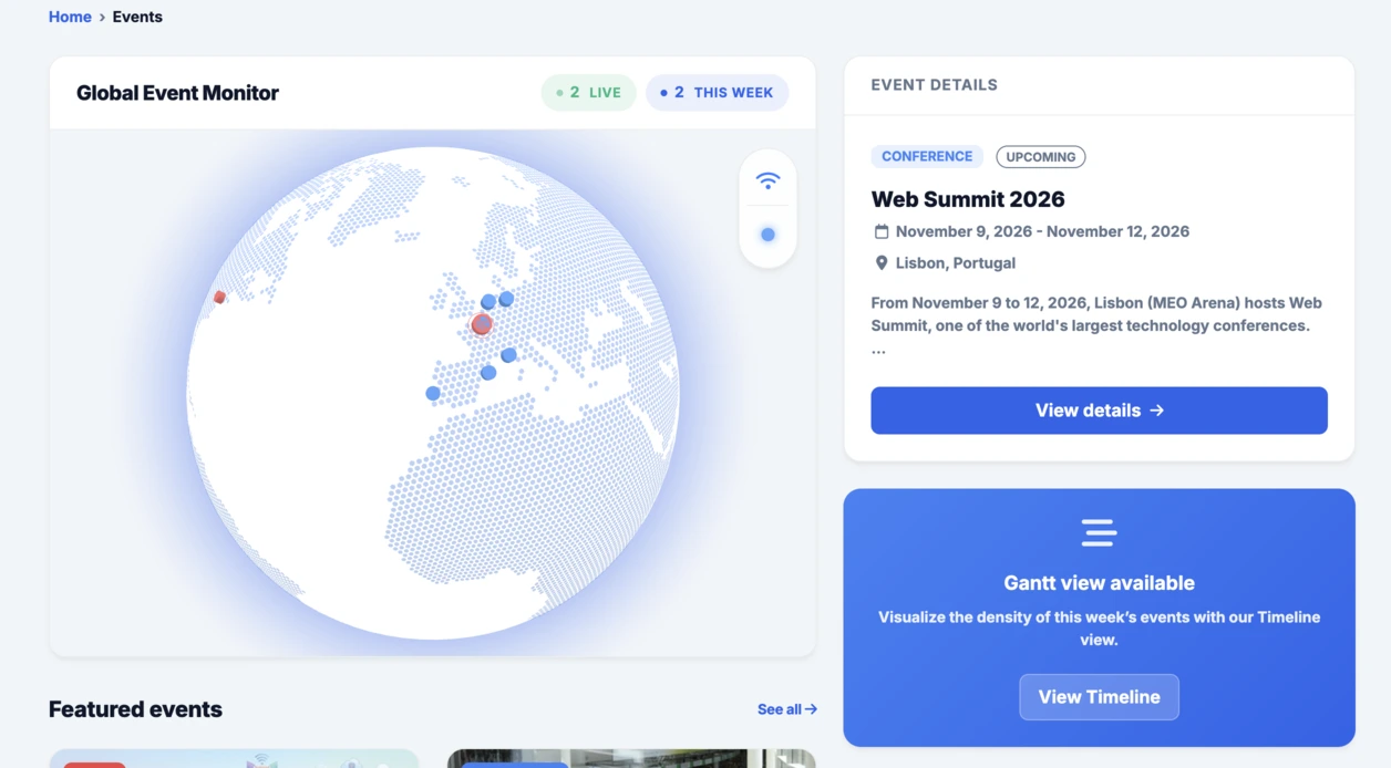
Events 섹션에 통합된 인터랙티브 글로브에 이어, 이 라디얼 대시보드도 같은 흐름을 잘 이어갑니다. 빠르게 실험하고, 구체적으로 시각화한 뒤, 그 아이디어를 Linkeum 안에서 더 발전시킬 가치가 있는지를 판단하는 방식입니다.