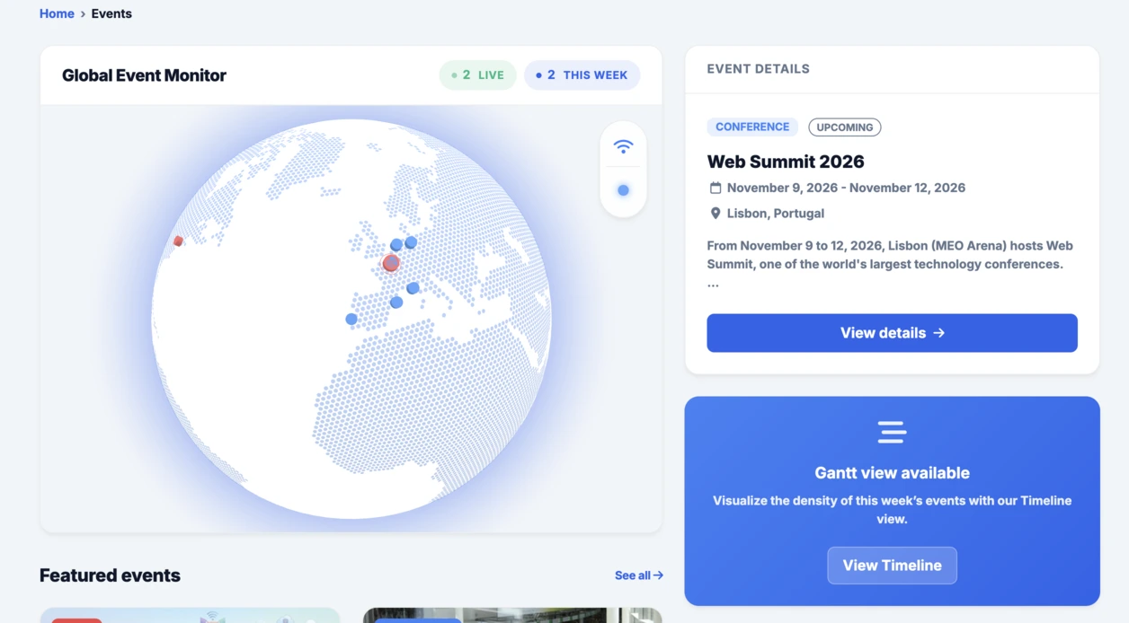
สำหรับพรอมต์วันอังคารครั้งที่ 15 นี้ แนวคิดคือการทดสอบอินเทอร์เฟซรูปแบบใหม่ที่ทั้งมีประโยชน์และโดดเด่นด้านภาพลักษณ์ นั่นคือแดชบอร์ดความก้าวหน้าส่วนบุคคลสำหรับติดตามเป้าหมายในด้านสำคัญของชีวิต
ที่ Linkeum พรอมต์วันอังคารไม่ได้มีไว้เพียงเพื่อสร้างเดโมที่ดูน่าประทับใจเท่านั้น แต่ยังใช้เพื่อทดสอบอินเทอร์เฟซที่อาจกลายเป็นส่วนจริงของผลิตภัณฑ์ในอนาคตด้วย ในครั้งที่ 15 นี้ แนวคิดคือการสร้างแดชบอร์ดความก้าวหน้าส่วนบุคคลที่สามารถแสดงความคืบหน้าของผู้ใช้ในหลายมิติของชีวิตได้อย่างชัดเจน
เป้าหมายคือการก้าวข้ามรายการเป้าหมายแบบเรียบง่าย และจินตนาการถึงคอมโพเนนต์แดชบอร์ดจริงที่อ่านง่าย ทันสมัย และมีพลังด้านภาพมากพอที่จะคุ้มค่ากับการสำรวจต่อไป
พรอมต์ที่ใช้
ครั้งนี้ พรอมต์ถูกเขียนในโหมด code only เพื่อให้ได้ไฟล์ HTML แบบสแตนด์อโลนโดยตรง ซึ่งทดสอบได้ง่าย จับภาพหน้าจอได้ง่าย และอาจนำกลับมาใช้ภายใน Linkeum ได้ในภายหลัง
พรอมต์ที่ส่งให้ Qwen มีดังนี้:
Generate code only.
Create a single self-contained HTML file with embedded CSS and JavaScript that builds a premium “Life Progress Dashboard” for Linkeum.
GOAL
The dashboard must help a user track progress across the major areas of life based on personal goals.
This is not a landing page.
This is not a marketing page.
This is a real product dashboard section designed for daily use.MAIN VISUAL
Build a large multi-ring radial progress chart as the main hero visualization.
Use a free JavaScript charting library suitable for radial / circular progress visualization.
Prefer Apache ECharts.The chart must represent 8 life categories:
- Wealth
- Career
- Learning
- Health
- Network
- Personal Projects
- Discipline
- Well-being
Each category must have:
- a progress percentage,
- a target marker or target logic,
- a label,
- a distinct but refined visual treatment.
Use realistic sample values such as:
- Wealth: 78
- Career: 64
- Learning: 82
- Health: 71
- Network: 58
- Personal Projects: 69
- Discipline: 75
- Well-being: 67
At the center of the radial visualization, display:
- “Overall Progress”
- and a combined percentage, for example 71%
The radial chart should look elegant, structured, readable, and premium.
Do not make it look playful or gimmicky.
Do not create a chaotic radar chart.
Do not use a generic fitness-app aesthetic.LAYOUT
Create a full dashboard section around the chart with:
- A left or center main chart area.
- A right-side details panel with category cards.
- Small KPI cards above or below for:
- Current streak
- Goals completed this week
- Best momentum
- Needs attention
- A “Focus Areas” card listing:
- Top 2 categories falling behind
- Top 2 categories improving fastest
- Small trend indicators or mini progress bars in the detail cards.
DESIGN STYLE
The design must match a premium Linkeum-like style:
- deep navy background or navy-tinted surfaces
- lighter blue highlights
- subtle amber/gold accents
- clean white or off-white text
- modern, professional, executive-grade UI
- modern fintech + personal intelligence dashboard
Avoid:
- neon colors
- rainbow palettes
- glassmorphism overload
- generic startup hero sections
- excessive gradients
- cartoonish visuals
Use a refined design system with:
- modern spacing
- subtle borders
- soft shadows
- polished cards
- clean typography
- a strong visual hierarchy
TECHNICAL REQUIREMENTS
- Output only one HTML file
- Include all CSS and JavaScript inside the HTML
- Use CDN imports only if needed
- Prefer Apache ECharts via CDN
- The result must run immediately when saved as an .html file and opened in a browser
- No external assets except the chart library CDN and web fonts if needed
- No frameworks like React, Vue, or Tailwind
- Pure HTML, CSS, and JavaScript only
- Code must be clean, readable, and well-structured
RESPONSIVENESS
The dashboard must be responsive.
- On desktop: chart + side panel layout
- On mobile: stacked layout with excellent readability
- Maintain strong visual hierarchy on smaller screens
INTERACTION
Even if this is a static HTML demo, make the UI feel interactive:
- hover states on cards
- hover emphasis on chart areas if possible
- subtle animated loading for the chart
- filter tabs such as 7D / 30D / 90D / 1Y
- active state styling
CONTENT
Use realistic product-like copy, for example:
- “Your life goals at a glance”
- “Focus on what moves the needle”
- “2 categories need attention this week”
- “Momentum is strongest in Learning and Wealth”
QUALITY BAR
The result should look like a real product dashboard mockup that could be screenshotted for an article and potentially reused later in a real product.Do not explain anything.
Do not output markdown.
Do not wrap the code in triple backticks.
Output raw HTML only.
ผลลัพธ์
ผลลัพธ์ที่ Qwen สร้างขึ้นเป็นฐานที่น่าเชื่อถืออย่างมาก อินเทอร์เฟซนี้สร้างขึ้นรอบกราฟเรเดียลหลายวงขนาดใหญ่ตรงกลาง พร้อมด้วยการ์ด KPI แผงโฟกัส และบล็อกรายละเอียดสำหรับแต่ละหมวดหมู่
สิ่งที่ทำให้การทดสอบนี้น่าสนใจไม่ใช่แค่ผลลัพธ์ด้านภาพเท่านั้น ที่สำคัญยิ่งกว่านั้นคือ AI ได้สร้างโครงสร้างแดชบอร์ดที่น่าเชื่อถือ นำกลับมาใช้ซ้ำได้ และมีความเรียบร้อยมากพอที่จะใช้เป็นฐานสำหรับโมดูลของ Linkeum ในอนาคต
ทำไมการทดสอบนี้จึงสำคัญ
พรอมต์วันอังคารนี้แสดงให้เห็นว่าพรอมต์ที่ดีสามารถสร้างได้มากกว่าเดโมที่น่าประทับใจ มันยังช่วยสร้างต้นแบบอินเทอร์เฟซผลิตภัณฑ์จริงได้อย่างรวดเร็ว ด้วยตรรกะที่ชัดเจน ลำดับชั้นที่สอดคล้องกัน และศักยภาพด้านคุณค่าในระยะกลาง
หลังจากลูกโลกอินเทอร์แอกทีฟที่ถูกรวมเข้าไปในส่วน Events แล้ว แดชบอร์ดแบบเรเดียลนี้ก็สานต่อแนวคิดเดียวกันได้อย่างดี นั่นคือทดสอบอย่างรวดเร็ว มองเห็นภาพอย่างเป็นรูปธรรม แล้วจึงตัดสินใจว่าแนวคิดนั้นควรได้รับการพัฒนาต่อภายใน Linkeum หรือไม่