For this Prompt Tuesday #12, we wanted to break the visual codes of finance. The goal? Ask the AI to design a financial market infographic that looks like a luxurious encyclopedia or museum plate.
Finance can sometimes seem visually austere. Between cluttered dashboards and stock photos of men in suits shaking hands, finding original formats to explain investing is difficult.
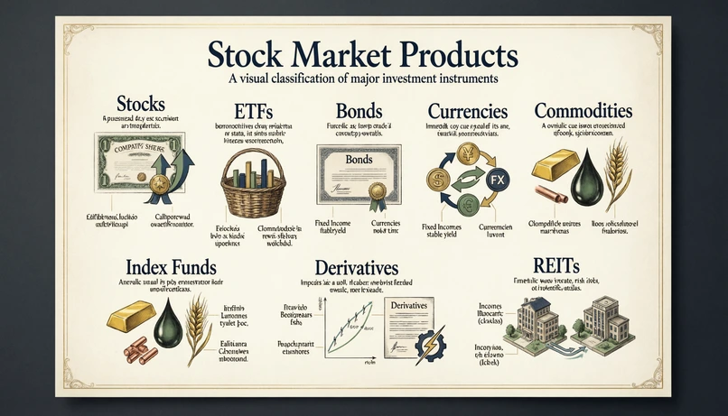
For this Prompt Tuesday #12, we wanted to explore a different graphic direction on Linkeum: transforming the classification of stock market products (Stocks, ETFs, Bonds...) into a true work of art, at the crossroads between modern editorial infographics and vintage botanical plates.
The prompt used
To get this result without the AI drawing actual plants or tree leaves, we had to be very directive regarding the art direction. The prompt was written in English, with particular attention paid to the "premium" style.
Act as an expert editorial designer, infographic art director, and premium finance visual specialist.
Create a highly detailed 16:9 landscape infographic poster about major stock market product categories. The image must look like a refined scientific wall chart or a museum-quality educational poster, not like a botanical herbarium with real plants.
Subject: The poster explains the main families of financial market products in a beautiful, visual, structured way (Stocks, ETFs, Bonds, Currencies, Commodities, Index Funds, Derivatives, REITs).
Art direction:
- Premium, elegant, high-end fintech aesthetic
- A sophisticated editorial infographic, halfway between a vintage scientific plate and a modern financial poster
- Clean composition, balanced spacing, beautiful hierarchy, visually rich but not cluttered
- No real plants, no flowers, no leaves, no herbarium specimens
- Use symbolic visual metaphors, icons, miniature diagrams, category frames, subtle connectors, elegant labels, and classification logic
- Refined cream, ivory, soft charcoal, deep navy, muted gold, and subtle green palette
- Crisp typography, elegant headings, small annotations, fine linework
- Luxurious paper texture or premium poster texture
- A modern-finance-meets-scientific-atlas mood
Optional enhancement: Make the poster feel like a rare “Atlas of Financial Instruments” plate, as if it belonged to a collector’s encyclopedia of global finance. The composition should be artistic, precise, and highly curated.
Why this prompt is interesting
The main trick of this prompt lies in the final block "Optional enhancement". By specifically asking the AI to imitate an "Atlas of Financial Instruments" belonging to a collector, we force it to adopt an extremely structured, luxurious, and meticulous composition, which perfectly matches Linkeum's premium DNA.
Moreover, the list of negative constraints ("No real plants, no flowers...") is vital: as soon as the words "vintage" or "encyclopedia" are used, the AI has a reflex to draw nature. Here, we force it to use purely conceptual metaphors.
The result... and the text challenge!
The visual rendering generated by the AI is superb: the composition is balanced, the colors are elegant (cream, navy blue, gold), and the overall mood immediately gives a "High-end" feel to concepts that are otherwise very technical.
However, this raw image highlights the biggest current limitation of generative AIs: handling small text. If you look closely at the labels and arrows, the generated text looks like an indecipherable alien alphabet!
The "Pro" method for your designs
Is this a failure? Absolutely not! In the web design world, AI is used to create the "background" and not the final layout.
The best method is to keep this magnificent composition generated by Qwen, import it into a tool like Canva, Figma, or Photoshop, and cover the fake AI text with your own text boxes using crisp typography. This gives you the best of both worlds: the artistic power of AI and human editorial rigor!