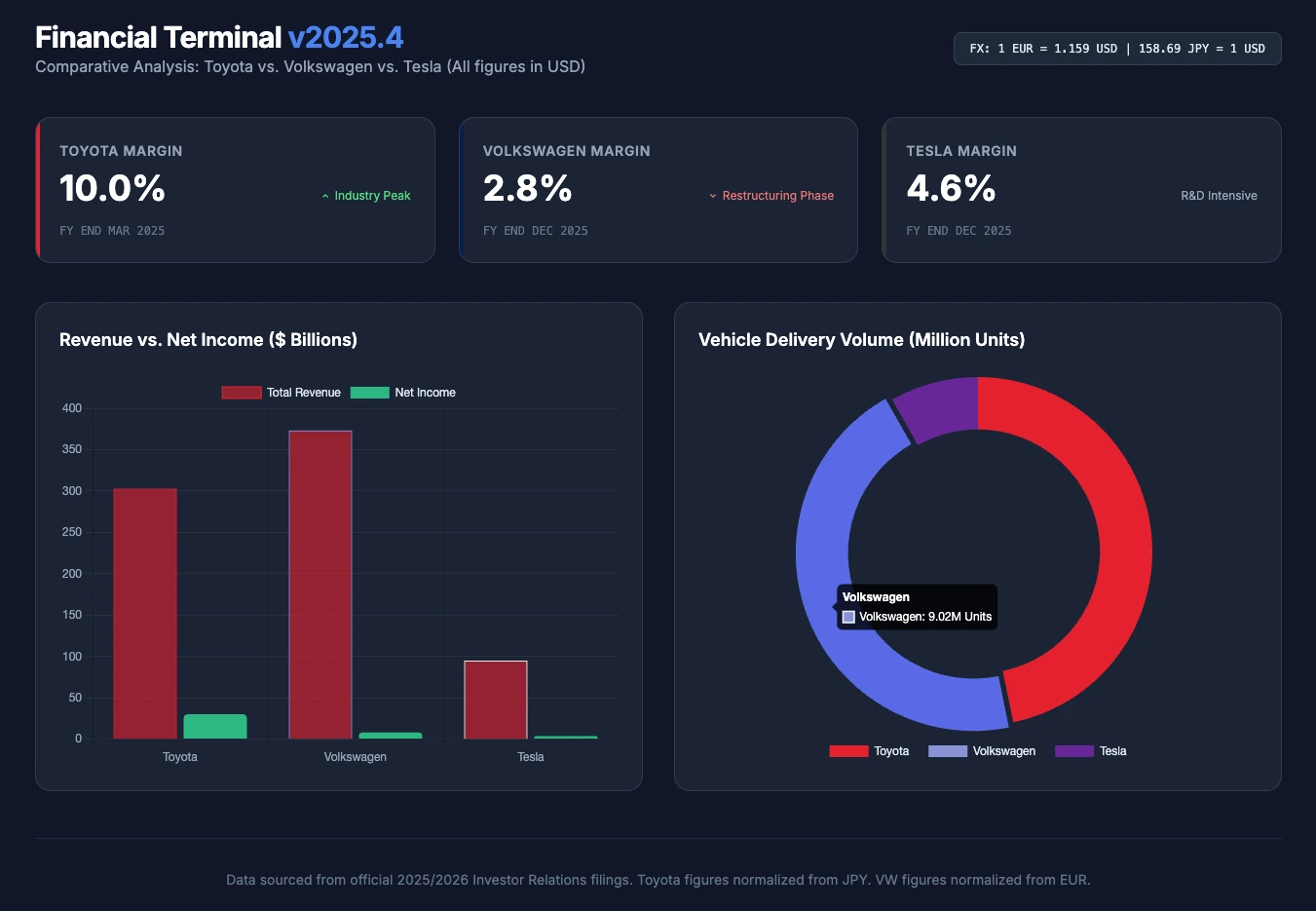
This week, we bridge our new Finance section with the power of Artificial Intelligence. The challenge? Asking an AI to analyze the results of three automotive giants (Toyota, Volkswagen, Tesla), convert their respective currencies, and generate an interactive visual dashboard in a single click.
Fundamental analysis of companies takes time, especially when you want to compare international companies that do not publish their financial statements in the same currency. An analyst must search for annual reports, isolate the right indicators (KPIs), convert currencies, and finally build their charts.
For this 5th Tuesday Prompt, we asked an Artificial Intelligence model (Gemini, in this case) to do all this research, mathematical normalization, and web development work for us.
Today's use case: comparing the performance of Toyota (Japan), Volkswagen (Germany), and Tesla (United States) for the year 2025.
The Prompt of the week
Here is the prompt we used. To avoid AI hallucinations (inventing numbers), we directly provided the official investor relations links of the three automakers.
Feel free to copy this prompt, run it in Perplexity, Copilot, or Gemini (which have web access), and change the companies to adapt it to your own investment needs!
Act as an expert financial analyst and UI/UX developer. I need to compare the latest full-year financial results of three major automakers: Toyota, Volkswagen, and Tesla.
Step 1: Data Gathering & Normalization Use your web-browsing capabilities to visit the official Investor Relations pages for each company:
- Toyota: https://global.toyota/en/ir/
- Volkswagen: https://www.volkswagen-group.com/en/investor-relations-15698
- Tesla: https://ir.tesla.com/
Extract the latest full-year data (2025) for these 4 KPIs:
- Total Revenue
- Net Income
- Operating Margin (%)
- Total Vehicles Delivered/Sold
Convert all financial figures (Yen for Toyota, Euro for VW) into US Dollars (USD) using the current exchange rate so the comparison is fair and accurate.
Step 2: Infographic Dashboard Generation Generate a beautiful, modern, single-file HTML dashboard to visualize this comparison.
- Use Tailwind CSS (via CDN) for the styling. Make it look like a premium financial terminal (dark mode).
- Use Chart.js (via CDN) to create two animated charts:
- A Bar Chart comparing "Revenue vs. Net Income" side-by-side for the 3 brands.
- A Doughnut Chart showing the market share based on "Total Vehicles Delivered".
- Create 3 stylish "Metric Cards" at the top of the dashboard displaying the Operating Margin (%) for each brand, using their respective brand colors (Red for Toyota, Blue for VW, Dark Grey for Tesla).
Output ONLY the complete, working HTML code so I can copy, paste, and render it immediately in my web browser.
The result
Instead of showing you the long lines of generated HTML and Javascript code, we displayed the code in our browser and took a screenshot. The rendering you see at the top of the article is the one produced by the AI.
The code generated in a single go was clean, and visually, the rendering is concise and very professional. I only had to manually adjust a few hexadecimal color codes for better visibility and consistency.
A vital note on AI-generated financial data
The most impressive point of this test lies in the final numbers. For this exercise, the AI was absolutely flawless. It retrieved the exact data from the 2025 year-end financial statements of the three groups (such as the $94.83 billion in revenue for Tesla), and applied a perfect mathematical conversion from the Euro and the Yen to the US Dollar, even displaying the conversion rates used to allow us to verify.
However, a golden rule remains: always verify the numbers that have been generated. Artificial intelligences can suffer from hallucinations regarding numerical data, especially if they scan complex PDF documents. It is therefore essential to go and read the official publications yourself in case of doubt before making the slightest investment decision.